AI solutions
What we do
Services
Experts in
How we work


Real estate teams aren't short on data. Property records, listing feeds, market trends, deal pipelines, geospatial layers, it's all there. The problem is it lives across five different systems, arrives in inconsistent formats, and takes someone's afternoon to turn into a report that's already stale by the time it lands.
Generic BI tools patch part of that gap. But frequently, they are either not built for property data or lack the needed level of customization. You end up stitching things together and still not getting what you need.
That's where custom data visualization services change the equation.
We've built 10+ real estate solutions and 11+ data visualization platforms at Clockwise. Across those projects, we hit the same walls: fragmented data sources, geospatial rendering limits, dashboards that worked for engineers but not for brokers. So, we know how to help you overcome these obstacles.
In this article, we break down what actually goes into building real estate data visualization that works: data types, visualization formats, architecture requirements, common challenges, and a development roadmap built around RE-specific constraints.
Real estate data visualization is the practice of turning property-related data (listings, market trends, geospatial information, deal pipelines, financial metrics) into interactive dashboards, maps, charts, and reports that teams can actually work from.
Raw data doesn't drive decisions. A table of 4,000 parcels doesn't tell you which three are worth calling on today. A spreadsheet of monthly transactions doesn't show you where the market is drifting. Data visualization in real estate surfaces the signal inside the noise and puts it in front of the right person at the right time.
Specific real estate data visualization benefits depend on who's using it.
| Role | What visualization solves |
| Investors / Acquisitions teams | Identify promising properties faster, track deal pipeline health, present clean data to stakeholders |
| Brokers / managing brokers | Monitor agent performance, track listings and closings, spot market shifts before they become problems |
| Property managers | Real-time view of occupancy, maintenance status, rent collection, and lease expirations across the portfolio |
| Founders / CTOs | One consolidated view across operations, with no more pulling numbers from four different tools |
The underlying data is almost always the same. What changes is the layer built on top of it.
Not all RE data is the same, and the format that works for one type is often wrong for another. Plotting financial trends on a map makes no sense. Showing geospatial parcel data in a bar chart loses everything that makes it useful. The real estate data visualization format has to match the structure of the data and the decision it's meant to support.
Here are the four main data categories in real estate and what works for each.
| Data type | Key metrics | Best visualization |
| Geospatial / Property | Location, parcel size, zoning, ownership | Interactive maps, heatmaps, polygon layers |
| Market Trends | Price trends, inventory, days on market | Line charts, bar charts, choropleth maps |
| Financial / Deal Pipeline | ROI, costs, revenue, deal stages | KPI cards, waterfall charts, pipeline funnels |
| Lead Generation | Property leads, owner contacts, outreach status | Filterable tables, Kanban boards |
This is the most RE-specific data type and the one where generic BI tools fall short. We're talking about property locations, parcel boundaries, zoning classifications, ownership records, and neighborhood-level attributes.
Map-based visualization is the natural fit here: interactive layers built on tools like Mapbox GL or Google Maps API, with filters for property type, size, price range, and status. In our StoneBay project, we used Mapbox GL API to give the acquisitions team a live, filterable map of land parcels across Texas, pulling data from multiple listing sources via API and surfacing it as an explorable visual layer. Managers could filter by location, size, price, and parcel type without touching a spreadsheet.
Best formats: Interactive maps, heatmaps, polygon overlays, clustered markers with drill-down detail panels.
Price movements, days on market, inventory levels, absorption rates, rental yield by area — this data only makes sense over time and across geographies. A single snapshot tells you almost nothing. The pattern across 18 months tells you a lot.
Best formats: Line charts for time-series trends, bar charts for period-over-period comparisons, choropleth maps for geographic price distribution.
Revenue per property, acquisition costs, ROI by deal, rent collection rates, outstanding payments, budget vs. actual — this is where leadership and investment teams live. They need a high-level read on portfolio health with the ability to drill into specifics.
Best formats: KPI cards for top-level metrics, waterfall charts for cost and revenue breakdown, pipeline funnels for deal stage tracking, tables with sortable columns for granular financial review.
For investment and brokerage teams, leads are properties: parcels that might be worth pursuing, owner contact details, outreach history, and follow-up status. The challenge is volume: hundreds or thousands of records that need to be sortable, filterable, and trackable across stages.
In StoneBay, we solved this with a dedicated Leads module with filters by property type, location, price, and size, plus a Kanban board to track each lead from initial save through to purchase. What was previously a manual search process became a structured, visual workflow.
Best formats: Filterable data tables, Kanban boards for pipeline stages, list views with status indicators, saved search dashboards.
To make data visualization in real estate fast, reliable, and useful in daily work, focus on the following five areas.
RE data rarely lives in one place. Listing platforms, county records, MLS feeds, CRM systems, skip-tracing providers each have their own structure, update frequency, and access rules. Before any visualization layer can work, that data needs to be pulled, reconciled, and stored consistently.
In StoneBay, the first challenge we solved was exactly this: connecting the platform to multiple real estate listing sources via APIs so property data could be aggregated automatically instead of gathered manually. That integration layer became the foundation on which everything else was built on. Without it, the Leads module, the map view, the filters wouldn’t have reliable data to work with.
Basically, this means: standardized data models, clear field mapping across sources, scheduled sync jobs or event-driven ingestion, and error handling for when external APIs change or go down.
What users see in a dashboard is the surface. The work happens underneath: collecting data from sources, cleaning it, aggregating it, and storing it in a format optimized for fast reads.
Without this layer, every dashboard load hits raw transactional data directly. That's fine for small datasets. At scale, it's where performance falls apart.
For RE platforms specifically, this layer needs to handle:
Getting these real estate data visualization techniques right is what separates a dashboard that loads in under two seconds from one that times out when a manager opens it during a morning standup. We cover the architectural side of this in our guide to data analytics platform development.
Rendering thousands of property markers, parcel polygons, or heatmap layers in a browser isn't the same as rendering a bar chart. Push too much data to the client at once, and the map becomes unusable: slow to load, laggy to interact with, and broken on mobile.
Solving this requires deliberate decisions on the backend: tile-based map rendering, server-side clustering of markers at lower zoom levels, lazy loading of detail data on interaction, and geometry simplification for large polygon datasets. On the frontend, libraries like Mapbox GL handle GPU-accelerated rendering that makes large geospatial layers viable in-browser, but only if the data pipeline feeding them is structured correctly.
A dashboard built for everyone ends up working for no one. The gap between what an acquisitions manager needs and what a property manager needs is wide. Try to serve both from one interface, and you get something cluttered for both. Role-based design fixes that: same underlying data, different views on top. Investors get portfolio KPIs and map-based deal sourcing. Brokers get listing performance and agent activity. Property managers get occupancy, rent tracking, and maintenance queues.
This extends to access control. Permissions belong in the data layer, not bolted onto the UI after the fact. Not every user should see every property, deal, or financial record.
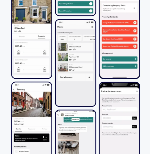
Across our projects, Propa is a good example. The platform served landlords and tenants from the same backend across web, iOS, and Android. Landlords got full management controls; tenants got a focused portal: their tenancy details, payments, a direct line to their landlord. Same data, completely different views, access control enforced at every level, without fragmenting the codebase.
Define roles first, build views around them, treat access control as an architectural constraint.
Interactive maps, real-time filters, large sortable tables, drill-down charts — these put real demands on the frontend. An outdated or poorly chosen stack makes each of these features slower to build and harder to maintain.
In StoneBay, we built the frontend on React with Redux for state management, Apollo and GraphQL for flexible data fetching, and Mapbox GL for map rendering. That combination gave the team the performance headroom to handle large datasets on the map layer and the flexibility to add new modules (Projects, Contracts, User Management) without rewriting the foundation.
The right stack doesn't just affect performance at launch. It determines how fast the product can evolve as requirements grow.
Visualizing RE data is harder than visualizing most other business data. You're working with multiple external data sources that you don't control, geospatial datasets that strain browsers, and end users who are brokers and agents, instead of data analysts. Here's what to expect and how to handle real estate data visualization pitfalls.
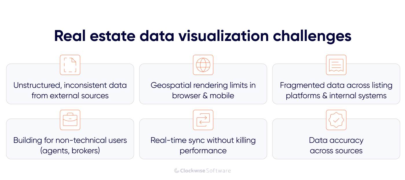
Real estate data doesn't arrive clean. Addresses are formatted differently across providers. The same parcel might appear under two different IDs depending on which listing source you pull from. Duplicate records are common. Fields that exist in one API don't exist in another.
If this isn't handled at the ingestion layer, it surfaces later as inconsistencies in the dashboard: properties appearing twice, filters returning wrong results, metrics that don't match across views.
Solution: Treat data standardization as a first-class engineering problem, not an afterthought. That means field normalization on ingestion, deduplication logic keyed to stable identifiers like parcel numbers, validation rules that reject or flag malformed records, and a clear schema that all sources get mapped to before anything hits the database.
Putting 10,000 property markers on a map sounds simple. But pushing that much geometry to the browser at once produces something that crawls on desktop and breaks on mobile.
Solution: The right approach combines several techniques: server-side marker clustering so that at lower zoom levels the map shows grouped counts instead of individual pins, tile-based rendering for polygon data like parcel boundaries and zoning layers, lazy loading of property detail data triggered only when a user clicks or zooms in, and geometry simplification for large polygon datasets that don't need full precision at scale.
On the frontend, Mapbox GL is one option for GPU-accelerated rendering of large interactive map layers. It is the tool we used in StoneBay, though the same approach can be implemented with other mapping libraries. Performance still depends on delivering the right level of detail at each zoom level.
Most real estate businesses don't run on one system. There's a CRM, a listing platform, maybe an MLS integration, county record access, a skip-tracing provider, and internal deal tracking, all running separately. Getting a unified visualization layer across all of that means dealing with different schemas, different update cadences, and different access patterns simultaneously.
Solution: The answer is a centralized data layer that acts as the single source of truth for the visualization system. All external sources feed into it, get normalized, and get stored in a schema designed for both reporting and operational use. Dashboards never query source systems directly. They query the reporting layer, which is always consistent and always fast.
This one doesn't get enough attention in technical discussions. The brokers, agents, and property managers using these tools every day are experts in real estate, not software. An interface that makes sense to an engineer won't necessarily make sense to someone who's used to working from printed MLS sheets.
Solution: Clear labeling over technical field names, filters that match how RE professionals think about properties (not how the database stores them), map interactions that feel intuitive without a tutorial, and dashboards that surface the answer instead of just the data. The goal is for a broker to open the platform and immediately know what needs attention, without having to construct that picture themselves.
Some RE data needs to be current: active listing status, deal stage changes, payment updates in a property management context. But pushing every data point through a real-time sync mechanism adds load, introduces latency risk, and can make a real estate data analytics dashboard unstable if the architecture isn't designed for it.
Solution: The practical approach is selective real-time updates: identify which metrics genuinely need live data and which can tolerate a 5-minute or hourly refresh, then design the sync mechanism accordingly. Event-driven architecture for high-priority updates, scheduled jobs for everything else. This keeps the system stable without forcing a trade-off between freshness and performance.
Building a RE visualization platform isn't a linear sprint from design to deployment. Here's how our real estate software development company approaches it.
Before anything gets built, you need a clear picture of what data exists, where it lives, and what shape it's in.
For most real estate app development projects, that means inventorying every external source (listing APIs, MLS feeds, county records, CRM exports, skip-tracing providers) and understanding how each one structures its data, how often it updates, and what its access limitations are. Then mapping how those sources relate: which fields overlap, which conflict, which are missing entirely.
It directly determines what's possible in the visualization layer. If parcel ownership data only updates weekly from a county source, a real-time owner lookup isn't viable without a separate provider. Better to know that in week one than in week eight.
This is also where the deduplication strategy gets defined. How to handle the same property appearing across multiple sources, which identifier becomes the canonical key, and how to reconcile conflicting field values.
From one of our projects

When we kicked off SmartSkip, a SaaS skip-tracing platform for RE investment teams, the client already knew exactly what was broken in their existing tool and how they wanted to fix it. They'd chosen their data aggregation approach before the first call and that clarity alone saved us dozens of hours in discovery. We still ran a full audit: requirements sessions three times a week, functional decomposition, work breakdown structure. But with the data landscape already mapped, we moved from discovery to a reliable estimate in under two months and shippedMVP in nine months.
That's what a well-scoped audit unlocks.
Different roles need different views. This step translates business roles into concrete real estate data visualization dashboard requirements: which metrics each role needs to see, at what level of detail, with what interaction patterns, and with what access permissions.
In a typical RE platform, this looks like:
Defining this upfront prevents one of the most common RE dashboard failures: a single view that tries to serve everyone and ends up cluttered, slow, and unused.
Once roles and metrics are defined, visualization choices should balance data structure, user needs, and the product’s visual direction.
Geospatial data goes on interactive maps: Mapbox GL for performance-heavy property and parcel layers, with clustering and tile rendering built in from the start. Time-series market data goes on line charts. Financial summaries get KPI cards and waterfall breakdowns. Lead pipelines get Kanban boards and filterable tables. Occupancy and portfolio status get status indicators and timeline views.
The wrong format doesn't just look bad but also makes the data harder to use. A table of 3,000 properties with no map context doesn't help an acquisitions manager find what they're looking for. A line chart of rent collection doesn't help a property manager see which tenant is overdue.
For more complex data visualization in real estate needs, like audio spectrograms, custom geospatial overlays, non-standard data shapes, libraries such as D3.js give the flexibility to build purpose-built components that standard chart libraries can't produce out of the box.
The data contract sets the rules. The next task is to build the pipelines, aggregation logic, refresh schedules, and validation needed to keep reporting data accurate and current.
When the processing layer is in place, frontend development moves faster and becomes more predictable. Developers can work with stable schemas instead of resolving data inconsistencies mid-sprint.
By this stage, we’ve already agreed on the interface logic and technical approach with you. Now we turn those decisions into working map components, charts, filters, drill-down flows, real-time updates, and responsive layouts.
RE dashboards have a specific UX constraint worth calling out: the map and the data table often need to stay in sync. Filtering the table should update the map. Clicking a map marker should highlight the corresponding row. That bidirectional interaction is straightforward to describe and genuinely tricky to implement cleanly. It needs to be scoped and designed before development starts.
We test each feature as it is built to make sure it matches the agreed requirements. Once everything is in place, we test the full platform end to end and check that all components and user flows work together as expected.
Plus, we run testing with real users, such as actual brokers, agents, or acquisitions managers, depending on the product. It helps us surface gaps and inconsistencies before they become embedded in the product, and makes sure the visualizations meet the users’ needs. It also reveals which metrics people actually look at versus which ones seemed important during requirements gathering but get ignored in practice.
From there, iteration is ongoing. Real estate data visualization isn't a one-time build. Data sources change, new listing providers get added, business processes evolve, and user needs shift as the platform matures. The systems that hold up over time are the ones designed with that reality in mind from the start.
McKinsey estimates AI could unlock $430–$550 billion in annual value across real estate globally. Most of that sits on the table because many platforms reach for AI as a marketing layer instead of applying it where it actually solves something.
Once your data is structured and reliable, AI can help users interpret it, find patterns, and get answers faster. Here are the applications that make the most sense in real estate data visualization.
Dashboards show what the data looks like. AI can explain what it means.
Instead of a broker staring at a dip in a market trend chart and guessing at the cause, an AI layer can surface a plain-language explanation alongside the visual: which variables shifted, over what timeframe, and what similar patterns have preceded in historical data. This is especially useful for non-technical users who understand real estate but not data analysis.
Implementation-wise, this works by connecting a language model to your pre-aggregated metrics and giving it the context it needs to generate relevant, accurate commentary. The key is keeping the model grounded in your actual data, not letting it speculate.
Instead of navigating filter menus, a user types: "Show me off-market parcels under 2 acres in Travis County listed in the last 90 days", and the system returns a filtered map view.
It's a natural language interface sitting on top of a well-structured data layer in action, translating user intent into structured queries and returning the result as a visualization. The data layer does the heavy lifting; the AI handles the translation between human language and query logic.
For acquisitions teams running high-volume property searches, this cuts the time between question and answer significantly and removes the dependency on someone knowing exactly which filters to combine.
Large RE portfolios generate enough data that manual monitoring becomes unreliable. Rent payments that are consistently late. A property whose maintenance request volume is spiking. A market segment where days-on-market suddenly increased across the board.
AI-powered anomaly detection flags these patterns automatically and surfaces them in the dashboard, often before a human analyst would catch them. The visualization layer then presents the anomaly in context: what the normal baseline looks like, when the deviation started, and how significant it is relative to historical variance.
This is particularly valuable for property management platforms where a portfolio manager might be responsible for hundreds of units across multiple properties.
Historical data has a use beyond reporting; it can inform what's likely to happen next. Predictive models trained on local market data surface leading indicators: which neighborhoods are showing early signs of price movement, which property types are likely to see increased demand, which leads in a pipeline have the highest probability of converting based on past deal patterns.
In a visualization context, that means a forecast layer on top of existing trend charts, showing where the model expects the market to go, with confidence intervals that give users an honest read on certainty.
The clearest RE application is lead scoring: a model trained on historical deal data ranks active leads by conversion probability and surfaces the top candidates in the acquisitions dashboard, so a manager working through 3,000 parcels knows where to start without building that picture manually.
The common thread across these AI in real estate use cases: they only work when the underlying data is clean and well-structured, and when the problem is narrowly scoped. A natural language query built on an inconsistent data layer produces inconsistent results. Anomaly detection without a reliable baseline produces noise. AI doesn't fix bad architecture, it amplifies what's already broken.
Depending on where you are in the process, different engagement models make sense. Here's how we typically work with RE and PropTech clients.
Starting from scratch or planning a major overhaul? This is the most straightforward path. One team handles everything end-to-end: discovery, UX design, data architecture, frontend and backend development, QA, and release.
Business analysts, designers, developers, and QA engineers work as one unit. No handoffs between agencies, no gaps between planning and execution. This works best when the project involves both product thinking and significant technical implementation, which most custom RE visualization platforms do.
It's the right fit when you need a single team fully accountable for the solution, from defining dashboard logic and data source integrations to shipping a production-ready visualization layer.
Already have an internal team but need to move faster or cover specific areas? A dedicated team that knows how to visualize real estate data plugs into your existing setup and takes ownership of a defined scope, whether that's the map layer, the data processing pipeline, frontend dashboard components, or performance optimization.
You stay in control of priorities and the roadmap. We handle execution. This works well for longer-term RE platforms where the visualization layer needs to evolve continuously alongside new data sources, new user roles, and expanding feature sets.
Not ready to move into development yet? Discovery is where scope gets defined before money gets spent on building the wrong thing.
Together with your team, we map your data sources, define user roles and their dashboard requirements, identify integration points and technical constraints, and outline the architecture needed to support a reliable, scalable visualization system. The output is a concrete implementation plan with realistic estimates.
This is a strong fit if you have a clear business problem but haven't yet translated it into technical requirements, or for teams that have started building and hit unexpected complexity and need to step back before continuing.
Many projects combine these models across stages. Start with full-cycle development to get the core platform built, then transition to a dedicated team for ongoing iteration as the product matures.
Real estate teams have more data than ever. The issue isn't access, it's in making that data usable for the people who need to act on it.
That's what custom data visualization is for. It replaces manual reporting with live dashboards, fragmented spreadsheets with unified data views, and generic BI tools with interfaces built around how RE professionals actually work.
But building it right takes more than picking a chart library. It requires a clean data foundation, a processing layer that handles external API complexity and geospatial scale, role-based UX that works for brokers and investors (not just engineers), and an architecture that holds up as data volumes and user demands grow.
We've built that across 10+ real estate solutions and 11+ data visualization platforms at Clockwise. If you're working through a similar challenge, whether you're starting from scratch or trying to fix what's already broken, we're happy to help you figure out the right approach.