AI solutions
What we do
Services
Experts in
How we work


Any business has to deal with data. Most companies collect data, but few manage to make the most of the information they collect and store over time. How can you get the most out of large amounts of information? Data visualization is the best weapon for this purpose.
Data visualization is one of the most powerful tools to turn data into money for any business, whether in education, government, finance, marketing, or any other field.
Visualizing data makes it easier to perceive that data by turning spreadsheets, plain text, and numbers into easily understandable graphics. And that’s not the only advantage. Visualizing data also:
As a company that provides data visualization services, we can tell a lot about data visualization software development. So, let's begin!
What is data visualization? Data visualization is the practice of representing numerical and textual data in the form of charts, graphs, maps, diagrams, and other visual forms. For example, the number of monthly visitors on a website may be presented in a bar chart to demonstrate increases or decreases in traffic, or a bar chart may show changing audience demographics.
Special data visualization software is used to extract the most important pieces of information and present it graphically without noise.
You have probably heard about Tableau, SAP Lumira, or Kibana. These industry leaders currently rule the data visualization software market.Let’s take a glance at what they can offer their users:
Tableau is the world’s most popular data analytics platform and business intelligence tool and offers much more than beautiful visualizations. It’s often used as big data visualization software and serves for building calculations from data, getting statistical summaries, and so on. Tableau can be connected to literally any database and provides a straightforward drag-and-drop editor.
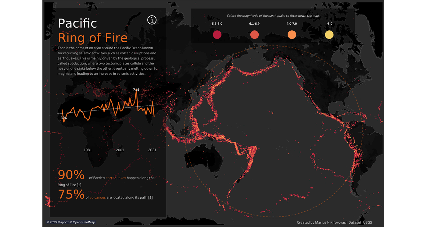
Seismic events in the Pacific Ring of Fire since 1965 (created in Tableau by Marius Nikiforovas)
Tableau is used by F5, Henkel, Splunk, and other well-known companies. Henkel, for example, uses Tableau to monitor global stocks of PPE and operations and claims the transition from simple reporting and analytics tools to Tableau allowed the company to save €4 million per year.
Kibana is an open-source analytical tool from Elastic Stack that focuses on being flexible and easy to use and targets non-technical users. It’s designed for analyzing data in Elastic. Kibana offers real-time summaries and charting of streaming data, location and time series analysis, and machine learning features. Airbnb, Jaguar Land Rover, and 9GAG are some of the well-known companies that use Kibana. For example, Jaguar Land Rover connects Kibana to its Advanced Product Quality Planning (APQP) process to monitor the vehicle production track.
SAP Lumira is a visual intelligence tool (it can also be described as a self-service business intelligence app) for companies of all sizes and in all industries. It enables users to create visualizations and stories using data from multiple sources. Companies that use SAP Lumira include Daimler AG, Kreg Tool, and Perspecta.
KPI dashboard made with SAP Lumira
But what if your data or your client’s data is far more complex than statistics? For instance, say you have audio streams that need to be visualized and then processed according to certain rules and algorithms. In this case, you’ll need a custom solution able to meet your specific needs.
How can you succeed in building such a solution?
If you want to create successful software, you can’t just follow the steps taken by someone else who is already successful. There’s a wide field of opportunities in the data visualization software market. How can you enter this market with your own promising startup? We describe the most common cases in which you can prosper from developing custom data visualization software. Which scenario do you find yourself in?
You can add data visualization functionality to your existing application. Take the example of Uber. From 2015 to 2018, Uber’s visualization team grew from 2 to 15 specialists. This is how Nicolas Garcia Belmonte, director of engineering, urban computing, and visualization at Uber, explains how the interactive visual system they develop helps Uber teams:
At Uber, these systems are used in a variety of domains, helping teams understand real-time positioning of vehicles, analyze supply and demand information by region, interpret systems like routing, navigation, and dispatch, identify gaps in the rider pick-up experience, and debug perception, prediction, and motion planning data flowing through our self-driving cars.
If you already run a software business or have a custom application to manage your internal company processes, think about the ways you, your team, or your users could benefit from data visualization. It may become a key component in taking your business to the next level.
Building a custom tool to process and visualize your existing data and serve your specific purposes is another way to go. The founders of the Rainforest Connection project contacted the Clockwise Software team with this kind of request. The startup records audio streams in the rainforest and needed to visualize them in the form of spectrograms. These spectrograms are then used for teaching a machine learning model to recognize natural and mechanical sounds to help prevent illegal deforestation.
If your team works with large amounts of data, think about how data visualization can increase your productivity and streamline your internal processes.
Today, data visualization tools are required in almost every industry and for any type of business, as they can ease the work associated with analysis, decision-making, and risk assessment. There are a lot of universal, feature-rich, and complex data visualization tools on the market. They work for clients from different industries, but only a small percentage are made for specific industries. The current market lacks data visualization tools created to support particular businesses. There are a lot of gaps that an entrepreneur with a custom solution can fill, as Reflect did.
Reflect is a data visualization tool created specifically for HR teams. It connects to the tools HR specialists use in their work to centralize the storage of employee-related data. As a tool that allows HRs to use fewer software tools and decreases the amount of manual work, Reflect raised $2 million in a pre-seed round led by XAnge in 2022.
If you feel inspired by Reflect’s success and want to try to repeat it, you can create a data visualization startup that could be used by a certain target audience (just as Reflect targeted HR teams). A key feature of such a product will be the possibility to receive comprehensive, attractive infographics by feeding the product information.
Once you have defined what type of data visualization project you would like to start, you can get acquainted with the process of implementing it.
If you want to build a quality product, you have to go through all stages of the SDLC (software development lifecycle). These stages are common for all types of software, so we won’t pay much attention to them in this article. Instead, we focus on the peculiarities of creating data visualization software to give you a clear overview of the technologies and competencies required to build such a tool.
You can’t start building data-based software without analyzing the actual data you want your software to process and visualize. Before starting the development process, your team should answer the following questions:
After the project discovery phase is finished and you have figured out the answers to these questions, you can proceed to the development process itself. With data visualization software, development starts with finding ways to extract and organize your data.
The next thing you should do is analyze where the data you plan to visualize is located. Most likely, you will either work with a company’s internally stored data or with information available in open sources on the internet. In each case, you will need a different strategy for data extraction.
If data is stored in a company’s internal database, the data visualization software you build must have access to that database.
When it comes to information from the web, your software should be able to correctly extract data from web resources and applications, excluding unnecessary information.
Working with your internal database is straightforward. However, to collect the needed data from web-based resources, you have to choose among several techniques:
Among all of these options, we recommend creating custom code for extracting and processing data. This is the safest and most flexible option that has the greatest chance of meeting your specific needs.
As data is extracted, it has to be stored somewhere. You can choose an open-source relational database management system like MySQL or a document-oriented database like MongoDB. If you’re not sure which type of database to choose, read our relational vs non-relational databases comparison.
Not all data you store needs to be visualized. The proper selection and arrangement of data is a vital feature of any visualization software.
To empower your software with such functionality, you need to create algorithms that will select, process, and filter data according to certain rules. For this task, you may use Python, Node.js, or R.
Data visualization tools are able to present information in various formats to draw attention to the most important information.
Let’s take a closer look at some of the visualization formats and their standard use cases that you may want to employ in your software:
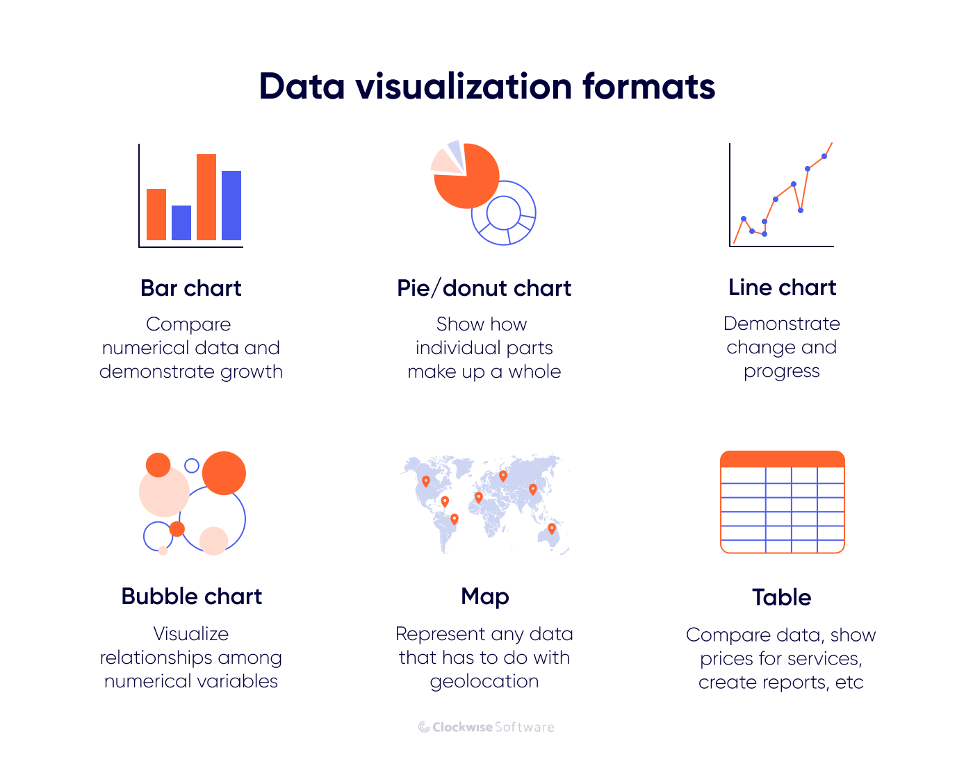
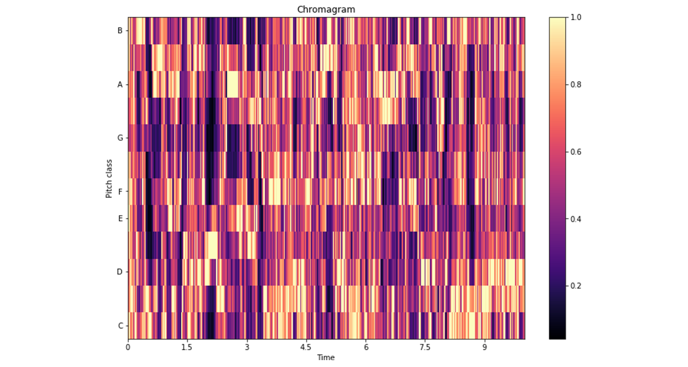
We have presented some of the most widely used types of visuals. There are also dozens of other creative formats you can implement in your software (scatter plot, pyramid chart, Venn diagram, fever charts, etc.). Your choice should depend on the type of data you want to visualize. For example, if your goal is to classify sound data by means of visualization, you may want to use a chromagram that displays the intensity of each pitch for each time interval.
You can browse the Beautiful News infographic book by David McCandless for some inspiration.
The most popular tools to implement visualization functionality in software are Python and D3.js. Python has plotting libraries that allow for implementing different types of visualizations (Matplotlib, Pandas Visualization, Seaborn, plotnine, and others).
D3.js, an open-source JavaScript library, is designed specifically for creating visualizations and works with modern web standards like HTML, CSS, and SVG. Since it’s a JavaScript library, D3.js can be used with any JavaScript framework of your choice (Angular.js, React, etc.). This also means that you don’t have to waste a lot of time looking for professionals who work specifically with D3.js: you can just cooperate with any JavaScript development company.
At Clockwise Software, we have extensive experience working with D3.js, applying it across a range of projects. For Rainforest Connection, we used D3.js to build interactive spectrograms that help visualize sound data from rainforest environments. For Sparrow Charts, we leveraged D3.js to enable users to create clear, dynamic marketing reports. The product continued to evolve independently and was rebranded as ViewMetrics in 2025.
At the last step of the custom data visualization software development process, you have to spot and correct errors in your product before it gets into users’ hands. Testing should be conducted simultaneously to the development process. This will allow developers to fix bugs and errors in the early stages of development. Your QA engineers should also implement multiple quality assurance techniques to test the finished software and ensure that it doesn’t have technical issues.
As you can see, creating data visualization software is a complex process that requires deep experience with specific tools. We recommend cooperating with a data visualization software development team or gathering your own internal team of data visualization experts.
By going through all of these steps, you should be able to get the first version of your custom data visualization software ready for release.
As your software is presented to the market, you will get the opportunity to reach out to your users to collect the first feedback. This feedback will help you improve your product, attract even more users, and increase demand for your product. Or, on the contrary, it may help you understand that you need to pivot.
We’ve mentioned several technologies you can use to build your data visualization software: the JavaScript-based D3.js and Node.js, Python and its frameworks, PHP, Ruby, R, and others.
However, data visualization is only a piece of your app’s functionality. The tech stack for frontend and backend development will depend on whether you build web-based data visualization software or a mobile application. If you are just starting down your path in visualizing and validating your idea, we recommend you choose a web application and therefore use one of the following technologies:
The selection of technologies is massive. But as you might guess, combining multiple technologies in a single project involves a fair amount of time, human resources, and money. And if you’re building your first data visualization product, over-investment is not what you’re looking for. To reduce your expenses, strive to minimize the number of technologies used.
When talking about implementing data visualization, consider one of two options:
JavaScript technologies can be used at all stages of the development process, which means you can hire a JavaScript development team to bring your whole project to life. This approach will let you build an MVP with minimal risks and at a minimal cost.
If you lack the expertise or resources to develop a data visualization platform from scratch, consider outsourcing your project to a JavaScript development company.
The actual cost of custom data visualization software development mostly depends on two factors:
The cost of custom data visualization software development varies greatly across countries, from tens of dollars per hour to hundreds of dollars per hour. The highest rates ($200+ per hour on average) are in the US, Canada, and Western European countries. The lowest rates (from $10 to $15 per hour) are in India and other South Asian countries.
If you want to find the perfect balance between price and quality, we recommend outsourcing custom software development to Eastern Europe, where Ukraine is one of the most reasonable destinations. In the Ukrainian market, you can find developers that will create a quality product according to your requirements for around $50+ per hour.
Most likely, you already have a list of features you want to implement in your data visualization application that will solve really complex problems. But investing a lot of money in a big project that doesn’t guarantee success is not the best way to go.
We recommend you start with an MVP. Developing basic functionality to validate demand with real users is a solid first step. When outsourcing development of a custom data visualization MVP to a Ukrainian company, your budget should start at around $100,000. If you want more complex software with extensive functionality, expect this price to at least double. But if you launch an MVP first and improve it gradually by gathering and analyzing user feedback, you can eventually get complex, multifunctional software that brings you profit with minimal risks.
If you want to get an exact time and cost estimate for your software, contact us and tell us about your idea. We will provide you with a detailed estimate of the money and time required to develop your product.
An excellent data visualization tool can boost your existing business or turn into a prominent startup. If you want to succeed in the data visualization field, you need to build software that can select and extract key information from your internal database or accessible web resources, structure it, and visualize it in a neat and understandable manner. For this, you need a team of data visualization software specialists and the right set of development technologies.
Follow the plan with your internal team or outsource this task to experts that can build custom data visualization software for you in a short time.
FAQ
The best programming languages for developing data visualization software are JavaScript, Python, and R.
For data visualization, you can use such tools as Tableau, Grafana, Kibana, SAP Lumira, and Infogram.
Data visualization doesn’t necessarily require coding. The majority of tools currently on the market allow for creating visualizations without coding skills. However, if you want to build a custom data visualization tool, you will either have to code it yourself or outsource this task to a software development team.
Data visualization software can be used by any company or business that collects data to gain insights from vast amounts of data and make data-driven decisions.