AI solutions
What we do
Services
Experts in
How we work


ERP systems collect and process massive amounts of data every day. Finance, inventory, operations, supply chains get tracked, stored, and updated, often in real time. But without proper visualization, this data can be difficult to interpret and even harder to act on.
Dashboards, interactive reports, and visual metrics fix that. They turn raw ERP data into clear, readable views that teams can actually work with: monitor performance, catch issues early, and see how different operations connect before small problems compound into bigger ones.
Our ERP software development company has delivered 10+ custom solutions across logistics, construction, manufacturing, and other industries. And beyond ERP, we've built data visualizations for a wide range of products, structuring social media data, organizing information across hundreds of clients, handling real-time IoT feeds, and yes, even visualizing sound patterns from the Amazon rainforest.
So, we’ve seen up close what makes visualizations useful in practice.
In this article, we’ll focus on how data visualization works in ERP systems:
ERP systems centralize data from across the business, including finance, operations, inventory, and other core functions. They are built to process and store information efficiently, but that doesn’t automatically make the data easier to understand or use in day-to-day work.
Data visualization helps close that gap by turning ERP data into clear, structured views that are easier to read, navigate, and act on. Rather than digging through raw tables or static exports, you get a clearer view of current business activity and can identify where action is needed. This reduces manual reporting, makes day-to-day monitoring easier, and helps your team make faster decisions using current data. If you are working with large and complex datasets, understanding how to use data visualization for ERP becomes a very practical need.
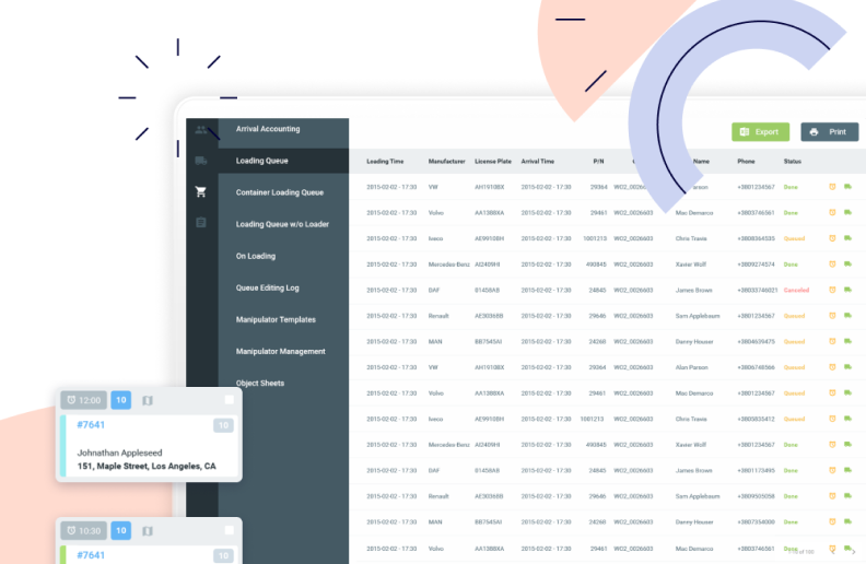
ERP dashboards pull data from multiple parts of the system and present it in one place, so each department can see not only its own metrics but also relevant information from other teams. This can be almost any data your team needs visibility into: revenue, expenses, order volume, production output, inventory levels, delivery status, and workforce activity.
For example, an ERP system for your supply chain can link order data with inventory availability, production capacity, and delivery timelines within a single interface. With this visibility, your team can understand not just what is happening, but why it is happening and what impact it may have on other areas.
Plus, the same ERP data can be visualized differently depending on who uses the dashboard. Executives may need a high-level view of revenue, costs, and operational performance, while managers need more detailed data on bottlenecks, delays, and team productivity. Operational teams, in turn, need real-time status updates that help them react quickly to issues. This role-based approach keeps dashboards focused. Instead of showing every available metric to every user, the system presents the data each team needs to make decisions in their area.
To see how this works in practice, let's look at the main visualization formats our clients requested (and what elements made those visualizations useful).
In our ERP projects, we’ve seen that using different visualization formats is no longer optional. Different data needs different presentation. Some metrics belong on KPI cards. Others need charts, tables, filters, drill-down reports, or real-time status views. Force everything into the same format and you don't get clarity, you get a dashboard nobody wants to use.
That's why ERP systems typically combine several visualization types, each chosen based on what users actually need to monitor, analyze, or act on. Here are the most common dashboard and reporting formats, grouped by purpose.
KPI dashboards give executives and managers high-level ERP-powered business analytics. Revenue, profit, operational efficiency, order fulfillment rates, cost indicators are the metrics that businesses usually want to see on a dashboard like this to see whether things are on track or quietly drifting off course.
In an ERP context, these dashboards do more than display numbers. They align departments around shared goals and give leadership the signal they need to make strategic calls, without digging through reports from five different departments to get there.
Operational dashboards focus on day-to-day activities and the current state of business processes. Their structure depends heavily on the team using them: logistics teams may need visibility into order flow and delivery status, manufacturing teams may track production progress and resource utilization, while retail ERP users may focus on stock levels and inventory movement. The point is to help each team stay on top of its workflows, address problems early, and keep operations on track.
As ERP teams move toward advanced analytics and AI development, analytical visualizations are built for going deeper. We are talking about exploring data over time, spotting patterns, and supporting forecasting and performance overview. In practice, this looks like trend analysis across sales or revenue, cost structure breakdowns, and budget vs. actual comparisons.
These charts give you the context to understand how performance is shifting, where spending is drifting, and what the numbers are likely to look like if current trends hold. That's the kind of visibility that drives better long-term decisions.
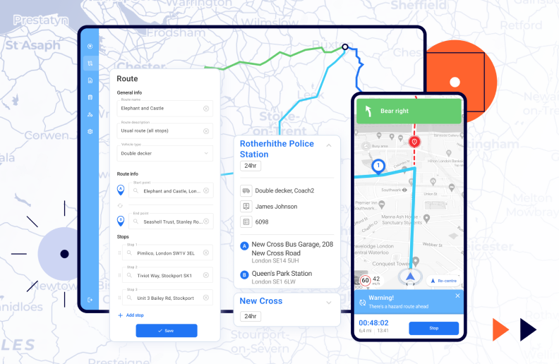
Real-time dashboards are built for environments where waiting on a report isn't an option. They display continuously updating data (live order tracking, production line status, delivery and fleet movement, system alerts, anomalies), so operational teams can respond the moment something shifts.
When speed matters, this is the format that keeps things from escalating. Not a summary of what happened, but a live read on what's happening right now.
Still, ERP visualization is not just about choosing the right charts. It also involves technical, data, and usability challenges.
Visualizing ERP data is harder than it looks. Unlike standalone analytics tools, you're working with high volumes of tightly interconnected data, multiple user groups with different needs, and business logic that doesn't always map cleanly to a chart or graph. That's why this is something that requires deliberate architectural planning and software development risk management from the start.
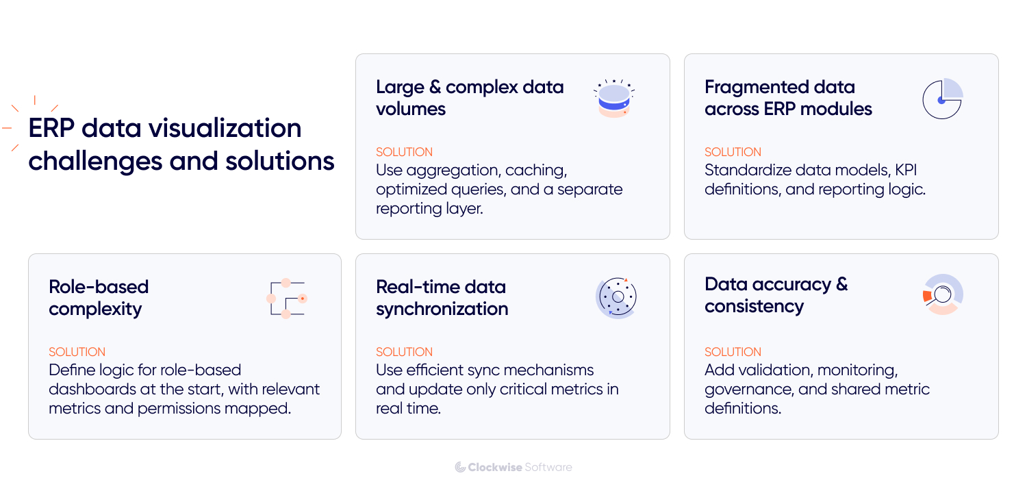
Systems like automotive ERP constantly process large volumes of data across finance, operations, inventory, production, logistics, and more. When dashboards need to combine that data in real time (or run complex queries across multiple sources), performance becomes a real concern. Slow load times, stale data, and unnecessary strain on the core ERP system are all common symptoms.
Solution: To keep dashboards responsive, ERP systems usually need a stack of deliberate decisions: data aggregation and preprocessing, caching, optimized queries, proper indexing, and in many cases, a dedicated reporting layer sitting separately from the transactional system. Together, these keep dashboards fast and reliable without putting the core system under pressure every time someone refreshes a report.
ERP data is often spread across modules with different structures, logic, and metric definitions. That fragmentation makes it genuinely hard to build a consistent view of business performance. Pull numbers from the wrong sources without reconciling them first, and you end up with dashboards that contradict each other.
Solution: Standardize before you visualize: unified data models, a centralized reporting layer or data warehouse, and clear definitions for key metrics across modules. Once that foundation is in place, dashboards can surface connected data without producing conflicting numbers or leaving users second-guessing what they're looking at.
ERP systems serve a wide range of users, and in industry-specific cases, for example, a custom ERP for food industry, what an executive needs to see is fundamentally different from what a production manager, quality manager, warehouse manager, or ops team member needs to act on.
Executives want the high-level read. Managers want to drill into bottlenecks and performance gaps. Operational teams need real-time updates they can respond to mid-shift. Try to serve all of them with one universal dashboard, and you end up with something that's either overwhelming or irrelevant (usually both).
Solution: We design ERP dashboards around user roles, permissions, and decision-making needs. Role-based views, customizable widgets, and department-specific dashboards help each user focus on the metrics that matter to their work without exposing unnecessary data.
In logistics, manufacturing, inventory management, construction ERP system, and other time-sensitive use cases, dashboards need to reflect current conditions. But pushing constant updates through the system has its own costs: increased load, latency, and dashboards that become unstable when the data flow isn't designed to handle it.
Solution: Real-time dashboards need efficient synchronization mechanisms, event-driven architecture where needed, and carefully configured refresh rates. Not every metric has to update every second, so it is important to prioritize real-time updates only for the data that directly affects operational decisions.
Even the best dashboard will not help much if the underlying data is inaccurate. Inconsistencies can appear because of delayed updates, integration issues, duplicate records, or differences in how separate ERP modules define the same metrics. If these problems are not addressed, dashboards may show a distorted picture and lead teams to the wrong decisions.
Solution: Data analysis and visualization accuracy depends on validation rules, synchronization checks, error monitoring, and clear data governance. Teams also need consistent metric definitions across modules, so the same KPI means the same thing for finance, operations, sales, and management.
To handle these challenges properly, you need to get several technical and product fundamentals right.
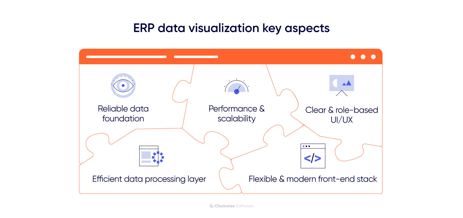
Effective data visualization in ERP systems depends on more than the charts users see on the screen. It also depends on data quality, the way data is collected, processed, and stored, the technologies behind the dashboard, and the UX decisions that shape how people interact with metrics. Let’s look at these aspects one by one.
ERP dashboards bring together data from different modules, systems, and external sources, so data consistency has to be planned from the start. If information arrives delayed, incomplete, or structured differently across sources, even a well-built dashboard will show a distorted picture. Garbage in, garbage out, regardless of how clean the UI looks.
We faced a similar challenge while developing Attention Nest, a social media analytics platform. Different social media platforms returned historical data under completely different rules: some allowed access to longer time windows, others only returned data from the last 2-3 days, and some required additional approvals just to access specific metrics.
We solved it by building a custom data accumulator that pulled API data at regular intervals and stored snapshots in the platform's own database. That gave us a reliable, consistent data layer to build long-term reports from, independent of whatever limitations existed at the source level.
The same logic applies to ERP-powered data visualization. Reliable dashboards need consistent data models, clear metric definitions, proper synchronization between transactional and reporting layers, and validation rules that catch errors before they surface in a report someone is making decisions from.
What users see (dashboards, charts, filters, reports) is only the surface. The actual work happens in the layer underneath, and that layer is what determines whether visualization holds up at scale.
This processing layer is responsible for collecting data from ERP modules and external systems, moving it through pipelines, cleaning and grouping it, storing it in the right format, and preparing it for fast access. Without it, every report load hits raw transactional data directly, and that's where performance falls apart.
For both on-premise and cloud-based ERP systems, we design a dedicated processing layer that includes data ingestion logic, queues, ETL or ELT pipelines, pre-aggregated metrics, and separate reporting storage. This keeps heavy analytical queries away from the core ERP, so dashboards stay fast and stable as data volumes grow.
ERP systems don't stay the same size. Data, users, and complexity compound over time. Dashboards that perform well at launch can quietly degrade as the system grows, and by the time someone notices, it's already affecting daily work.
Staying ahead of that requires the right foundation: optimized queries, proper indexing, caching for frequently accessed data, and an architecture designed to handle concurrent users and large data volumes from the start. With those in place, dashboards scale alongside the system, without becoming slower or harder to use as things expand.
A strong backend only gets you halfway. If users can't quickly make sense of what they're looking at, the dashboard fails in practice, regardless of how clean the data is underneath. Dashboards need to reflect how each role actually thinks and works: clear metric hierarchy, intuitive navigation, and filtering that helps people cut through noise and focus on what's relevant to their decisions.
We applied the same principle while improving a lead analytics platform. The legacy system relied on simple tables, which made it hard to spot patterns, while the workspace itself used screen space inefficiently. We replaced the cramped interface with a dynamic leads chart that tracks confirmed and missed leads over time and optimized the leads table layout. As a result, users got 50% more effective table space and could view twice as much data at once.
For ERP systems, this kind of UX thinking is especially important. A dashboard should not just display data. It should help each user understand what changed, why it matters, and what to do next.
ERP visualization interfaces often need to support interactive charts, filters, real-time updates, and large datasets. If the front-end stack is outdated, adding these features becomes slower and more expensive.
We faced a similar challenge with Heads Up. The platform had legacy front-end limitations that made it harder to develop new dashboard functionality and improve user experience. To solve this, we helped migrate the interface to a more flexible React-based front end while keeping the existing backend. This gave the product team more room to build interactive dashboards, improve performance, and support more convenient work with complex health data.
After defining the foundation, we can move on to the practical side of ERP visualization development.
When we build ERP visualization solutions, the process runs through 6 key steps: auditing data sources, defining user roles, selecting the right metrics, choosing visualization formats, building a data processing layer, and testing dashboards with real users. Here's what each of those involves.
A good starting point is understanding what data exists in your ERP system and how it is structured. In most cases, that data is spread across multiple modules, each with its own schema, relationships, and timing for updates. Without a clear data map, a minimum viable product (MVP) dashboard can easily end up incomplete or give the wrong picture.
This is usually the stage where we identify the main data sources and integrations, look at how entities such as orders, inventory, and finance relate to one another, and check for inconsistencies or missing pieces that could affect reporting.
We saw this in one of our factory surveillance projects. The platform had to pull together data from multiple sensor-driven sources and show it through one monitoring interface. For the dashboard to work properly, those inputs first had to be structured consistently. We also built a mock data generator so the frontend could move forward before live server data was available. That preparation made the final visualization much more reliable.
Different users require different perspectives on the same data. A single universal dashboard rarely works in ERP environments. Instead, visualization should be designed around roles. For example:
Executives need high-level KPIs
Managers focus on performance and bottlenecks
Operational teams track real-time activities
This ensures that each user sees relevant data without unnecessary complexity.
One of the most common mistakes is trying to visualize everything. Effective ERP dashboards should focus on metrics that directly support a specific decision or workflow.
For example, if your goal is to improve order fulfillment, the dashboard should focus on order processing time, fulfillment status, delivery delays, and inventory availability. If the goal is financial control, it makes more sense to visualize revenue, costs, margins, budget performance, and overdue payments. For production efficiency, teams may need metrics such as output, downtime, resource utilization, and bottlenecks across production stages.
This way, each dashboard is built around a clear purpose instead of becoming a collection of disconnected metrics.
Different data types need different visualization approaches, and a proof of concept (PoC) can help validate the right one early. A format that works well for one kind of information may be a poor fit for another, and that can make the data harder to interpret.
Line charts are often a natural choice for time-based data, bar charts usually work well for comparisons, and real-time monitoring is often more effective in dashboard layouts that include alerts and status indicators.
Some products also require more specialized visualization models. In our Rainforest Connection project, for example, we worked on a system that visualized audio recordings from forests and oceans as interactive spectrograms. Users needed to zoom into specific frequency ranges, navigate long audio streams, and manually mark segments for machine learning training. That functionality was implemented with D3.js and Canvas, which made it possible to support detailed interaction with large, dynamic visual datasets. The broader point is that the right visualization model depends on the structure of the data and the way users need to work with it.
At this stage, we turn raw ERP data into a structure dashboards can actually use. This means defining where reporting data will be stored, which metrics should be pre-calculated, how often different datasets should be updated, and how dashboard queries will be separated from the core ERP workload.
This step helps turn raw ERP data into something the interface can display accurately and consistently. When this layer is designed properly, dashboards load faster, real-time views stay stable, and users see consistent metrics even when data comes from multiple modules or systems.
ERP visualization needs to be tested with real users and improved over time. In practice, teams often start with an initial set of dashboards, see how they work in real workflows, and then refine them based on feedback. That iterative process gives the frontend and visualization layers more room to evolve and helps reduce development risk.
Data visualization in ERP systems should be treated as an ongoing part of the system. It changes as the system grows, as data becomes more complex, and as business processes evolve. The best results usually come from building iteratively and focusing on real use cases rather than generic dashboards.
Depending on the scope of the project, existing infrastructure, and internal team capabilities, different cooperation models may be more effective. At Clockwise Software, we typically work with clients using one of the following approaches.
Starting from scratch or planning a major redesign? Full-cycle product development services is the most straightforward option. You get one team that can build your ERP data visualization solution end-to-end, from discovery and UX design to development, testing, and release.
You will have business analysts, designers, developers, and QA engineers working as one unit, so there is less friction between planning and delivery. This is especially useful when the project involves both product thinking and technical implementation.
It is the best choice when you need one team fully responsible for the solution, from shaping dashboard logic and reporting flows to building a production-ready visualization layer.
Need extra engineering capacity to move faster? Dedicated software developers can plug into your existing setup or take ownership of a specific part of the work, whether that is dashboard development, data processing, frontend implementation, or performance optimization.
It is a good fit if you already have an internal product or engineering team but need additional expertise to deliver faster or cover missing skills. You stay in control of priorities and roadmap, while we take care of execution.
This setup works best for long-term ERP initiatives where visualization continues to evolve along with the rest of the system.
Still shaping the scope and not ready to move into development yet? Software product discovery is where that work starts. Together with your team, we clarify what data should be visualized, which users need access to specific views, which metrics are important for their workflows, and what technical constraints should be considered upfront.
We analyze your ERP structure, map data sources, identify user roles, and outline the architecture required to support reliable and scalable visualization. The result is a clearer implementation plan with fewer assumptions and less delivery risk.
This phase is a strong fit for companies that need clarity before development begins and want to make sure the data visualization in ERP systems is based on real workflows, real data, and real business priorities.
The choice of cooperation model depends on your project goals, timeline, and available resources. In practice, many projects combine these approaches at different stages. For example, you can start with end-to-end development to build the initial solution and later switch to a dedicated team model for continuous improvement.
ERP systems generate enormous amounts of data across every part of the business. But without the right visualization layer, most of that data stays difficult to read, harder to act on, and largely underused.
Good visualization changes that. It gives teams a clear view of performance, surfaces issues earlier, and shortens the gap between insight and decision.
Getting there takes more than dropping charts onto a dashboard. It requires well-structured data, role-based views, solid performance architecture, and a design that actually fits how people work, not just how the system is organized.
At Clockwise Software, we've delivered 10+ custom ERP solutions alongside other data-heavy systems across logistics, manufacturing, healthcare, and more. In those projects, visualization turned complex, fragmented information into something teams could actually use day-to-day. If you're working through a similar challenge, we're happy to help you figure out the right approach.


![ERP Data Visualization [Formats, Challenges & Insights from 10+ ERP Projects]](/img/blog/erp-data-visualization/header-background-mid.webp)